

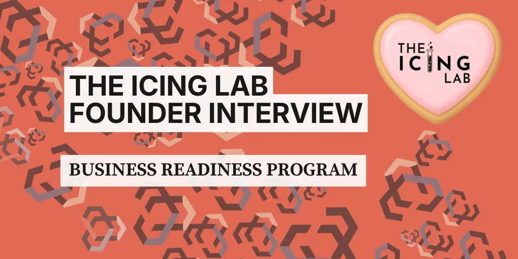
Founder Story: The Icing Lab
Business Readiness Program Founder Story: The Icing Lab Branding Transformation
One of the most exciting parts of the Business Readiness Program’s Idea To First Dollar Rock County entrepreneur program is helping founders refine businesses that already have strong momentum.
Felicia, founder of The Icing Lab, entered the program with something many early entrepreneurs are still working toward: a functioning brand, an engaged audience, and a product people genuinely love.
Her cookie decorating classes already had:
Strong social media engagement
A clear creative concept
Customers excited about the experience
Beautiful finished products
The Business Readiness Program focused on strengthening the visual brand so it matched the quality of the business she had already built.
Small Business Branding Help: Evaluating The Icing Lab Brand in the Business Readiness Program
During Week 4 of the Business Readiness Program, we analyze founder branding and visual identity.
Felicia’s brand already had strong ideas behind it, but a few issues were limiting its effectiveness.
The original brand included:
A heart shaped cookie logo
A typographic name design
A science inspired test tube icon
A soft pastel color palette
However, several design elements created challenges:
The heart shape was difficult to recognize at smaller sizes.
The letter spacing made the name harder to read.
The color palette was extremely muted, which reduced contrast and readability.
For a business built around bright, colorful decorated cookies and fun creative classes, the brand did not fully match the energy of the product.
Strong small business brand identity should reinforce what customers already feel when they encounter the business.
In this case, the cookies were vibrant, playful, and creative. The brand needed to reflect that same energy.
Startup Branding Strategy: Why The Icing Lab Leaned Into the “Lab” Concept
One of the most memorable parts of Felicia’s original brand concept was the test tube element.
It was a clever nod to her background as a scientist and connected perfectly with the business name.
Rather than removing it, the Business Readiness Program helped refine and emphasize the idea.
The updated logo design focused on:
Maintaining the typographic emphasis of the brand name
Adjusting letter spacing for better readability
Using the test tube and bubbles as a central visual element
Updating the cookie illustration so it clearly reads as a cookie
The result preserved the playful science theme while making the brand more recognizable and usable across digital platforms.
Small Business Logo Development: Strengthening The Icing Lab Color Palette
Color contrast is one of the most overlooked parts of small business branding strategy.
Originally, The Icing Lab used four muted pastel colors. While visually soft, the palette created problems with:
Accessibility for visually impaired users
Readability on screens
Print clarity on marketing materials
Inside the Program, we adjusted the palette by:
Unmuting the original colors to create richer tones
Adding a warm yellow-orange accent color
Increasing contrast to improve readability
These changes allow the brand to work better across:
Printed materials
Event signage
Packaging and merchandise
Strong branding must function consistently across all environments.
Entrepreneur Training Programs Wisconsin: Why Brand Consistency Matters for Small Businesses
The goal of branding inside the Business Readiness Program is not simply to design a logo.
The real objective is repeatable brand consistency.
Many early stage businesses operate with extremely small teams. Sometimes the founder is the only person working on marketing materials.
Other times, they may hand tasks to:
Virtual assistants
Interns
Freelance designers
When a brand system is clearly defined, anyone working with the business can easily maintain consistency. That means:
The same fonts
The same colors
The same logo variations
The same visual tone
This allows small businesses to appear polished and professional even with limited resources.
Rock County Small Business Success Story: The Icing Lab Brand Transformation
Felicia did not need to reinvent her business. She already had the most important elements:
A strong product
Engaging experiences
A clear understanding of her audience
The Business Readiness Program simply helped align the brand visuals with the energy of the business itself.
Now when people see The Icing Lab, they immediately get the same feeling customers experience in her classes.
Creative
Colorful
Welcoming
Playful
Exactly what a cookie decorating lab should feel like.
Business Readiness Program Rock County: Supporting Local Entrepreneurs
The Business Readiness Program incubator exists to help founders refine their ideas, strengthen operations, and build sustainable businesses that serve their communities.
Founder stories like The Icing Lab show how small improvements in branding and strategy can help a business stand out and grow.
Entrepreneurship often starts with a great idea.
Programs like the Business Readiness Program help turn those ideas into lasting businesses.